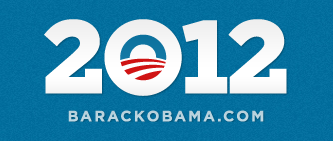
Keeping with the design aesthetic of the 2008 campaign but with a little bit of modernization, the new My Barack Obama campaign website has been launched sporting a 2012 BarackObama.com campaign logo. If the President wants Gotham Serif, he gets Gotham Serif (thanks Hoefler & Frere-Jones)…. So, Are You In ?

I have no issues with the choice of font or the Obama “O” logo. I’m irked with the kerning issues… especially with the large gap in between the 0 and the 1. I just don’t get how something like letter spacing could be missed when there’s only four characters AND this will be the main campaign logo. Sad.
Ethan, I haven’t been able to get this logo out of my head and had to take a look at what the other options could have been. I think the blue background is what led them to the logo being inset into the 0, instead of it being the 0 itself (they didn’t want a blue “sun” – wanted to keep it white). Here is a link to an image I created that shows what could have been done, and what I think might be done still. I think they will revise this logo before too long.
http://img222.imageshack.us/i/obama2012optionsrev.jpg/
very nice with the white background but I agree that the blue sun makes it hard to work with on blue…
Design fail. Will Target be the official campaign sponsor?
well, we know it won’t be WalMart… troll anonymously much ?
Sorry to offend with my comment and anonymity. I’m a graphic designer and just commenting on the logo. I saw the target immediately, was just surprised at the choice/oversight? from a design perspective. I’m also not a fan of the font, the serif on the 2. Just sayin’. If you think this was politically motivated, it’s not. I was a big Obama supporter in ’08 (and loved his campaign graphics).
No worries… I just saw it in blue and it felt a bit less target like to me…. not a whole lot to do with concentric circles, though, right ?